Sit N' Spin Productions
Logo • Asset Guide • Event Fliers • Brand Applications • Website
For Sit N' Spin Productions (www.sitnspinproductions.com), a Chicagoland-based electronic music collective, I developed a bold brand identity that reflected their inclusive, community-driven approach to live music. The project included logo design, visual identity, a brand asset guide, and promotional materials that captured the energy of their events—from intimate gatherings to large-scale parties with over a thousand attendees. The design emphasized professionalism and creativity while embodying the collective’s mission to deliver top-tier, authentic electronic music experiences without the clichés.
.png)
The Final Logo: Iconic Recognition & Anti-Cliché Edge
The client selected this design because it instantly delivered an iconic, instantly recognizable mark that successfully navigated the goal of avoiding electronic music clichés.
The concept behind the logo was to be so distinctive that it would be instantly recognizable amid a sea of other logos. While the name "Sit N' Spin" was sometimes forgotten, the community immediately recognized the distinct "no cheese" logo when mentioned.
Strategic Design Elements:
-
The Icon: The universally recognized "no symbol" crossed over a wedge of yellow cheese acts as a clear, visual mission statement—a commitment to delivering top-tier, authentic music experiences without the "cheesy" clichés of the industry.
-
Impact & Memorability: The graphic is bold and simple, ensuring high legibility and instant recognition across all event branding, from small digital graphics to large-scale banners.
-
Tone: The design perfectly balances professionalism and rebellious creativity, capturing the energy of their events while embodying the collective's community-driven mission.
The resulting logo is a memorable and impactful visual promise that Sit N' Spin Productions delivers authentic, top-tier electronic music experiences.

Brand Asset Guide: Enforcing the Anti-Cliché Visual Identity
The success of Sit N' Spin hinges on its bold, iconic recognition and its commitment to authenticity. This comprehensive Brand Asset Guide was developed to safeguard the collective's aesthetic integrity and ensure consistent brand application across everything from intimate digital promotion to large-scale event production. The guide establishes strict rules for the primary, secondary, and tertiary marks, the high-impact color palette, and typography hierarchy. This critical document ensures every piece of communication reinforces the mission: top-tier, authentic electronic music without the industry clichés.


Event Fliers: Translating Energy into Promotion
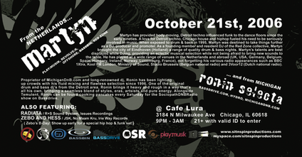
For an electronic music collective, the event flier is the most direct and crucial point of contact with the community. This portfolio of work demonstrates the system's ability to maintain a professional and recognizable brand presence while adapting its visual energy to suit the specific tone and scale of the event. The designs consistently leverage bold typography and high-contrast color to cut through the noise, capturing the dynamic and inclusive spirit of Sit N' Spin's top-tier, authentic music experiences.

Brand Applications: Wearable Identity & Event Memorabilia
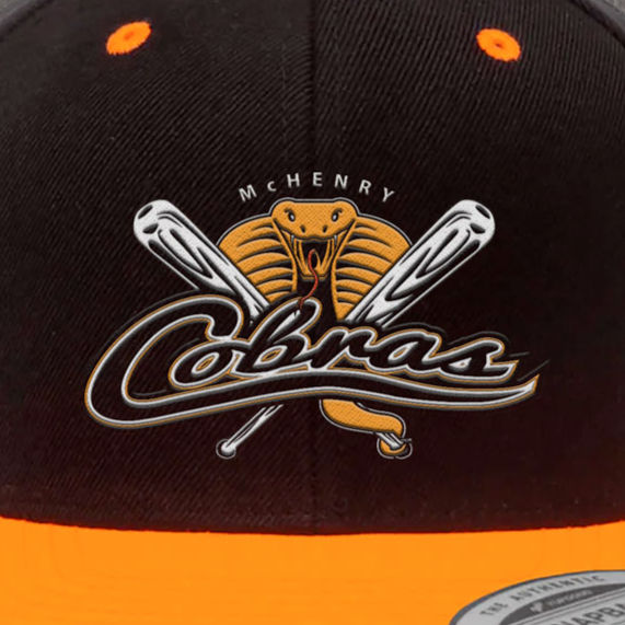
For a community-driven electronic music collective, merchandise serves as a badge of authenticity and community affiliation. These applications demonstrate how the iconic "No Cheese" logo translates into high-impact, desirable promotional products, effectively reinforcing the brand's commitment to top-tier, authentic music in the hands of the audience.


Website Design: The Minimalist Hub for Event Access
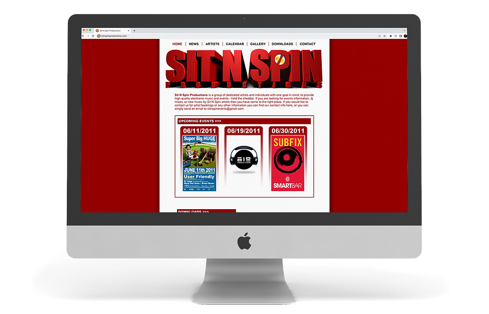
The website for Sit N' Spin Productions was designed to be a convenient, minimalist destination for the collective's community. The primary goal was to streamline access to critical information and downloads, using a focused, table-based design to prioritize clarity and speed. This clean structure allows the energy and content of the events to take center stage, serving as a functional, accessible online hub that complements the brand's bold, anti-cliché visual identity.

All Projects


