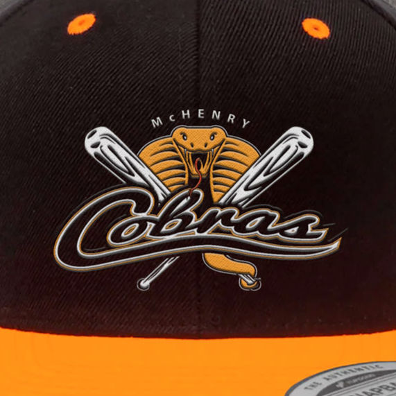
McHenry Cobras
Logo • Brand Applications
For the McHenry Cobras (www.mchenrycobras.com), a competitive youth travel baseball organization, I created a refreshed logo and visual identity that captures the team’s energy, spirit, and dynamic character. The redesign emphasizes boldness and athleticism while maintaining a professional, sports-friendly look that reflects both the competitiveness of the program and its commitment to developing young athletes on and off the field.
The Request
"We'd like to give the McHenry Cobras Youth Travel Baseball Team logo a new look and feel, a fresh design to make our team look more dynamic and appealing. Our goal is to showcase the energy and spirit of our young players and emphasize the lively nature of our team. We're open to explore any creative ideas that embody the essence of the Cobras while maintaining a professional and sports-friendly appearance."

THE REQUEST & RESULTS
Concept Phase: Visualizing Youthful Aggression & Spirit
Three initial sketch concepts were developed to capture the requested balance between the dynamic energy of youth baseball and the aggressive, professional spirit of the Cobra mascot. Each direction explores a unique composition for the mark, ensuring the final logo feels both lively and authoritative.

Concept A: Aggressive, focused, streamlined energy.

Concept B: Sports authority, classic competition.

Concept C: Lively, dynamic, professional intensity.
Refinement Phase: High-Impact Visual Energy
Based on feedback, these two refined concepts translate the initial sketches into high-impact, full-color marks. The goal was to finalize compositions that maximize dynamic movement and youthful spirit while maintaining a professional, aggressive appearance suitable for a competitive youth league.

Concept A: Lively, balanced, controlled aggression.

Concept B: Bold, competitive, maximum impact.


The Final Logo: Dynamic Energy Meets Professional Spirit
The team ultimately selected the refined Crossed Bats Concept because it best captured the required balance: fierce determination with classic athleticism.
The design features a bold, front-facing Cobra mascot coiled in a modern stance—a symbol of aggressive focus and spirit. The mascot is complemented by the traditional element of crossed baseball bats, which adds a touch of professional authority and competitive history.
Strategic Design Elements:
-
The Icon: The dynamic cobra and crossed bats create a high-impact, symmetrical emblem that projects immediate energy and team spirit.
-
Typography: The sleek, custom-designed script typography complements the emblem's aggressive curve, ensuring the logo feels contemporary and memorable while maintaining high legibility.
-
Color & Tone: The vibrant orange and deep black color palette conveys energy, resilience, and strength, ensuring the logo looks sharp and professional on uniforms, merchandise, and digital branding.
The result is a versatile and contemporary logo that perfectly captures the lively nature and fierce determination of the young players.
Brand Applications: Unifying Team Spirit and Fan Energy
The final logo system was applied to key merchandise to immediately establish a dynamic, professional, and unified team identity. These applications ensure that the brand’s energy is consistently represented, from the competitive look of the uniforms to high-quality fan gear and commemorative products.


All Projects


