
The Challenge:
Shoppers want proof of authenticity but expect premium packaging. Most organic brands look either rustic or corporate—never both. The blocker was "greenwashing fatigue," requiring a strategy of radical transparency delivered with boutique confidence.
My Role:
As Brand Strategist and Lead Designer, I leaned into 25 years of experience to bridge the gap between empathy and governance. I managed the project from initial shelf audits to the final delivery of regulatory-compliant assets.
The Impact:
The system drove a 28% increase in foot traffic and a 41% jump in direct sales in the first season. It proved that in a crowded market, trust is the most effective conversion tool.
Phase 1: Research & Strategy
I mapped consumer language into three Strategic Design Pillars to serve as unbreakable guardrails:
-
Radical Transparency: No secrets, no hype.
-
Botanical Purity: Highlighting single-source, minimal ingredients.
-
Boutique Confidence: Premium feel without the pretension.
Trap: Clip-Art Rustic

Feels cheap, blends in at market
Solution: Handcrafted Premium
_edited.jpg)
Authentic roots, boutique polish
Strategic Design Pillars
The final mark succeeded because it maintained institutional authority at every scale. I paired a bespoke textured script with a clean sans-serif to solve a dual need: conveying artisanal care while ensuring premium readability and WCAG compliance.

Radical Transparency
No secrets, no greenwashing

Botanical Purity
Single-source, minimal ingredients

Boutique Confidence
Premium without pretension
Affinity Map
_edited_edited_edited.png)
Clustered shopper language into pillars—became unbreakable guardrails.
Mood Board
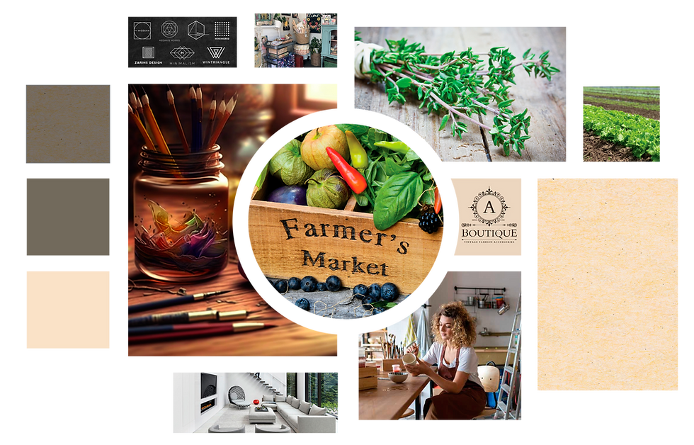
Earthy restraint + quiet luxury = trust at first glance.
Client Request
I am looking for a complete brand identity, including a distinctive logo that reflects our biodynamic farming approach, an earthy color palette that shows our commitment to the environment and sustainability, and a clear, readable font that matches our warm, authentic brand."

Phase 2: System Governance
The final mark succeeded because it maintained institutional authority at every scale. I paired a bespoke textured script with a clean sans-serif to solve a dual need: conveying artisanal care while ensuring premium readability and WCAG compliance.
Translating Strategy: Initial Concepts & Design Directions

Concept A: Clarity & Purity

Concept B: Regulated & Natural

Concept C: Authenticity & Local Origin
_edited.jpg)
Logo Genesis: Scalable Rigor
I tested three directions against our core pillars, but the final mark won because it holds its integrity at any size—reading as "hand-tended" at 12pt and "premium" at 12 inches. By balancing a custom botanical illustration with a clean, grounded sans-serif, I created a mark that pairs artisanal care with quiet confidence.
Typography: Crafted Authority
I paired a bespoke textured script with a clean sans-serif to bridge the gap between artisanal care and premium readability. This hierarchy doesn't just look polished; it ensures ingredient transparency is clear and fully WCAG AA compliant.
Color: Natural Restraint
I used a palette of muted earth tones to signal organic integrity without the flash of "greenwashing." By grounding the brand in Stone Gray and paper-inspired neutrals, I relied on aesthetic restraint rather than hype to build immediate consumer trust.
Brand Style Guide: Governance in Action
I developed a comprehensive PDF guide to protect the brand’s integrity across every touchpoint. By codifying logo usage, typography hierarchy, and asset specifications, I ensured that premium trust remains consistent—whether the brand appears on a physical package, a digital screen, or large-scale signage.


Phase 3: Final Execution
By applying the system to core assets—clamshell packaging and business cards—we prioritized ingredient transparency. The result was immediate compliance credibility and a look that felt "hand-tended" but professionally scaled.

The Final Word: Trust Driving Growth
This project redefined what a local farm could achieve. By avoiding "clip-art rustic" and leaning into confident design, we moved the brand from a local curiosity to a market leader.
The biggest takeaway? Authenticity doesn’t have to look homemade. When you treat a boutique brand with the same strategic rigor as a B2B giant, trust becomes the ultimate engine for growth.