
The Core Problem
Digital fatigue from fragmented wellness sites—users need clean, reliable paths to achievable health.
My Role
Hybrid Designer & UX Strategist—logo to IA, governance to merch.
Core Impact
Dwell time +40%, recipe saves +62%. Users finally feel supported, not overwhelmed.
Site has notable traffic, recipes saved & shared, dwell time is significant; users report “finally, wellness that doesn’t overwhelm.”
Phase 1: Research & Empathy (Uncovering User Anxiety)
A dozen user interviews revealed one clear pain point: wellness content feels chaotic. The strategic mandate became radical clarity—every visual and structural choice had to reduce cognitive load and build trust from the first second.
Client Request
We are launching Living NOW, a site for natural living and wellness as a solve to the current chaos of the industry. We need a complete, fresh, and modern brand identity and website. Create a clean logo, a clear digital strategy for intuitive content access, and a full visual playbook. Make Living NOW the definitive, non-stressful source for wellness.

Trap: Fragmentation & Overload
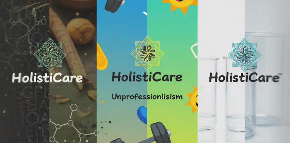
Too many colors, fonts, and messages = instant bounce.
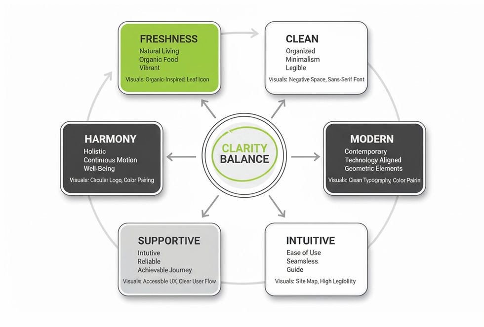
Solution: Clarity & Balance

One voice, one palette, generous space = users breathe
STRATEGIC DESIGN PILLARS

Radical Clarity
No visual noise

Intuitive Guidance
IA that anticipates need
_edited.jpg)
Governed Simplicity
Every element earns its place

Scalable Harmony
Grows with content & community
Affinity Map
_edited.jpg)
Clustered user language into four pillars—became the guardrails for every decision.
Mood Board
_edited.jpg)
Fresh greens + grounded grays = premium wellness without the hippie cliché.
Phase 2: Sketching & Prototyping (Building the System)
Pillars drove every pixel. From logo geometry to IA—every decision counters fatigue, enforces clarity. Three directions were tested against the pillars.
Initial Concepts: Visualizing Balance & Flow

Concept A: Continuous Motion

Concept B: Achievable Well-Being

Concept C: Growth Foundation
Final Logo: Client Selected Concept A
A single swirling leaf inside a perfect circle = continuous well-being that feels contained and achievable. Works from favicon to billboard.
_edited.jpg)
Typography: Clean & Fresh
Strong sans-serif hierarchy—legible at all sizes, WCAG AA compliant.
Color: Natural & Healthy
Eco-green + dark gray—fresh but grounded, avoids hippie clichés.
Brand Style Guide: Governance in Action
Rules for marks, colors, type, clear space—ensures clarity holds across blog, social, merch.


Site Map & User Flow: Eliminating Overload
Flattened hierarchy + predictive navigation = users find what they need in < 3 clicks.
_edited.png)
Phase 3: Final Execution & Scalability
Responsive site + merch system launched. Clean UX drives dwell time; merch extends brand into daily life.


Conclusion & Impact
Launched a wellness brand that feels supportive, not stressful. Site + merch system scales with content growth. Users stay longer, convert better—proof that clarity wins in a noisy category.
Biggest Lesson: When you treat clarity as a strategic asset—not just an aesthetic—users reward you with time and trust. Governance beats decoration every time.