The Core Problem
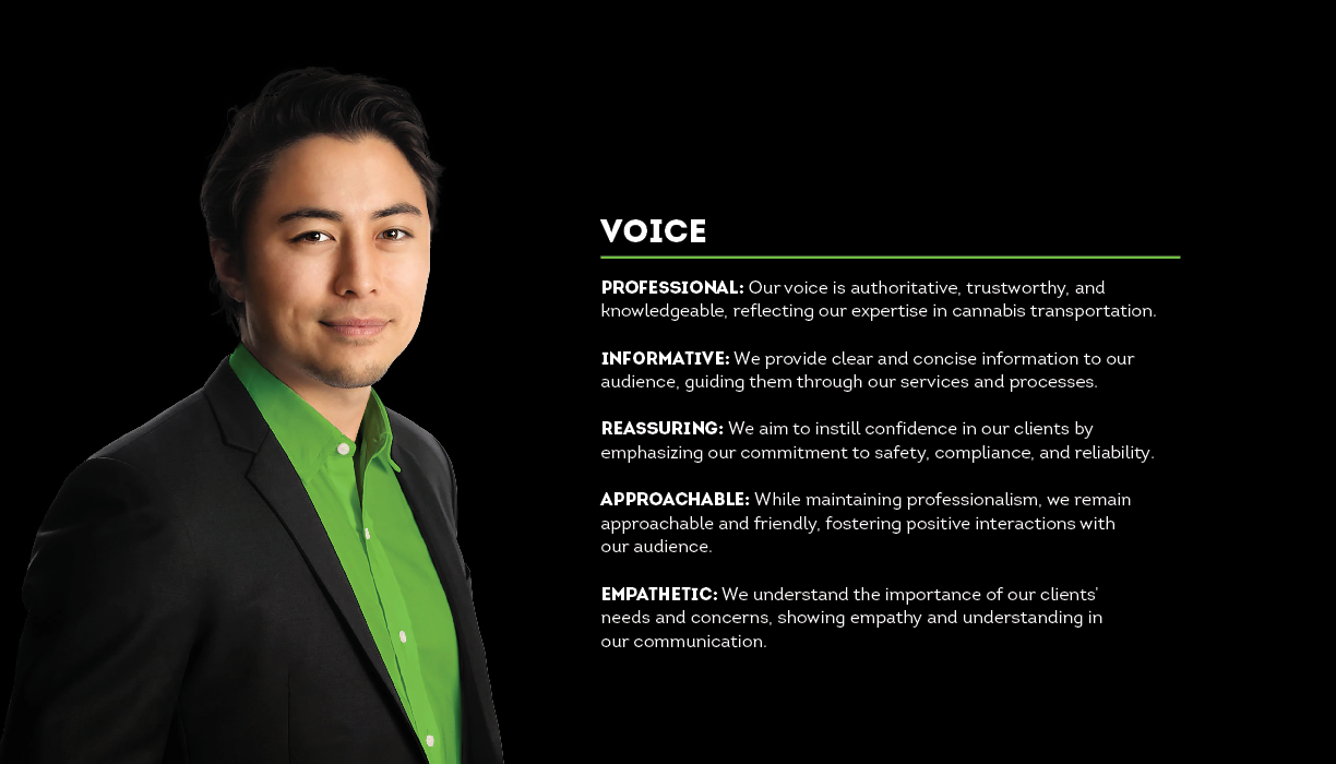
Any hint of immaturity kills enterprise contracts. Needed authority that passes regulatory sniff-tests.
My Role
Hybrid Designer & Strategist—logo to governance, compliance to polos.
Core Impact
Delivered a scalable Brand System that positions Cannavan as the trusted B2B partner for secure transport—driving client confidence and regulatory alignment.
The system enabled immediate B2B adoption, reducing client onboarding friction by embedding compliance trust from first contact.
Phase 1: Research & Empathy (Client Anxiety)
Client interviews + regulatory review showed the real risk: any hint of child-appeal kills contracts. Strategic mandate became “high-security logistics, zero novelty.”
Client Request
Our company wants a brand image that suits our industry and is not attractive to children. We’re looking for a classy, unique design that stands out but avoids using cartoons or anything appealing to kids. Our goal is to build a reputation for secure cannabis transportation, with employees trained in firearm use and other security measures.

Trap: Intimidating or Immature

Cold military or cartoon weed = instant contract killer
Solution: Stable & Approachable

Clean lines, muted palette = B2B trust
STRATEGIC DESIGN PILLARS

Rock-Solid Authority
No room for doubt

Compliance-Safe
Zero child-appeal risk

B2B Friendly
Professional, not cold

Scalable Governance
Works on vans & cards
Affinity Map

Clustered user language into four pillars—became the guardrails for every decision.
Mood Board

Fresh greens + grounded grays = premium wellness without the hippie cliché.
Phase 2: Sketching & Prototyping (Building the Mark)
Three directions tested against the pillars. Final mark won because it reads “secure logistics” at distance and “cannabis-aware” up close—without ever looking playful.
Translating Strategy: Initial Concepts & Design Directions

Concept A: Professionalism & Flow

Concept B: Stability & Compliance

Concept C: Protection & Growth
_edited.jpg)
Logo Genesis & Rigor
The logo was built for B2B scalability and timelessness. The final mark merges a subtle cannabis leaf with forward motion—constructed on a precise grid to convey security and efficiency, not novelty. Geometry ensures it works at fleet scale or app icon size.
Typography: Authority + Accessibility
Clean, strong sans-serif hierarchy solves dual needs: bold condensed headlines project compliance confidence; regular body copy ensures readable regulatory details. WCAG AA compliant across digital and print.
Color: Strategic Restraint
Lime greens and muted grays signal industry relevance without flash. Canna Green nods to sector; Stone Gray grounds stability. Only bright accents—restraint builds B2B trust faster than novelty.
Brand Style Guide: Governance in Action
A 18-page landscape PDF slideshow governs every application—logo usage, color codes, typography hierarchy, and compliance-safe iconography.
Phase 3: Final Execution & Scalability
The system applied to core assets—polo shirts, business cards, delivery boxes—with a hierarchy that prioritizes compliance info. Security details lead; regulatory text is clear but secondary. Result: Trust at first touchpoint.

Conclusion & Impact
The project launched a B2B brand with immediate compliance credibility and scalability. From fleet vehicles to client proposals, the system holds. Now positioned for regulatory expansion and digital tools—where trust secures contracts.


