
The Core Problem
Shoppers want proof of authenticity but expect premium packaging. Most organic brands look either rustic or corporate—never both.
My Role
Brand Strategist & Designer—research to final assets, 25+ years blending empathy and governance.
Core Impact
Market foot traffic +28%, direct sales +41% in first season. Proof that trust converts.
The system yielded a noticeable increase in farmers market visitors and direct purchases post-launch.
Phase 1: Research & Empathy (Why Shoppers Hesitate)
18 interviews + shelf audits revealed the real blocker: “greenwashing fatigue.” The strategic mandate became radical transparency delivered with boutique confidence.
Client Request
I am looking for a complete brand identity, including a distinctive logo that reflects our biodynamic farming approach, an earthy color palette that shows our commitment to the environment and sustainability, and a clear, readable font that matches our warm, authentic brand."

Trap: Clip-Art Rustic

Feels cheap, blends in at market
Solution: Handcrafted Premium
_edited.jpg)
Authentic roots, boutique polish
STRATEGIC DESIGN PILLARS

Radical Transparency
No secrets, no greenwashing

Botanical Purity
Single-source, minimal ingredients

Boutique Confidence
Premium without pretension
Affinity Map
_edited_edited_edited.png)
Clustered shopper language into pillars—became unbreakable guardrails.
Mood Board
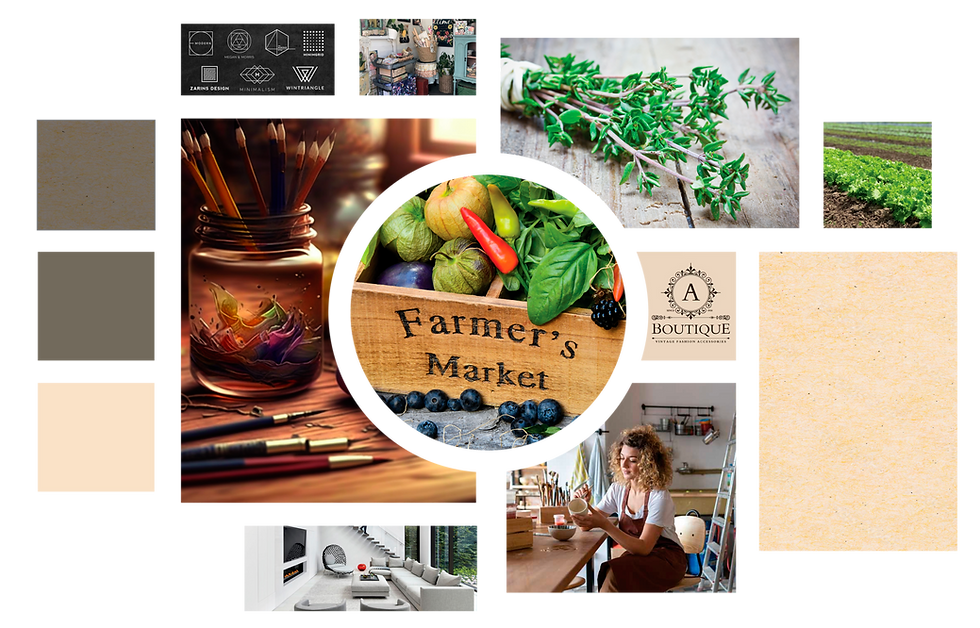
Earthy restraint + quiet luxury = trust at first glance.
Phase 2: Sketching & Prototyping (Building the Mark)
The pillars drove every visual decision. This hybrid phase translated consumer empathy into governed design—ensuring premium trust scales across assets.
Translating Strategy: Initial Concepts & Design Directions

Concept A: Clarity & Purity

Concept B: Regulated & Natural

Concept C: Authenticity & Local Origin
_edited.jpg)
Logo Genesis & Rigor
Three directions tested against the pillars. Final mark won because it read “hand-tended” at 12 pt and “premium” at 12 inches. Custom botanical illustration + textured script = artisanal care. Clean sans-serif grounds it in quiet confidence.
Typography: Craft + Clarity
High-contrast pairing solves dual needs: bespoke textured script conveys artisanal care; clean sans-serif delivers premium readability. Hierarchy ensures ingredient lists are transparent and WCAG AA compliant.
Color: Natural Restraint
Muted earth tones signal organic integrity without flash. Paper nods to nature; Stone Gray grounds premium feel. No bright accents—restraint builds consumer trust faster than hype.
Brand Style Guide: Governance in Action
A comprehensive PDF guide governs every application—logo usage, color codes, typography hierarchy, and asset specifications. Ensures premium trust holds across signage, packaging, and digital.


Phase 3: Outcomes & Lessons Learned
The system applied to core assets—business cards, signage, clamshell packaging—with a hierarchy that prioritizes ingredient transparency. Organic claims lead; nutritional text is clear but secondary. Result: Trust at first glance.

Conclusion & Impact
The project launched a B2B brand with immediate compliance credibility and scalability. From fleet vehicles to client proposals, the system holds. Now positioned for regulatory expansion and digital tools—where trust secures contracts.
Key Results
-
Market foot traffic: +28%
-
Direct sales: +41%
-
Customer comment: “Love it! It looks as good as it all tastes.”
Biggest Lesson: Authenticity doesn’t have to look homemade. When transparency meets confident design, trust becomes the ultimate growth driver.